
Case study · Dietary supplements
Plusssz. One brand, a whole rainbow of products.
Brand architecture and packaging system for one of the most recognisable dietary supplement ranges in Poland — from effervescent vitamin tubes to a children’s range and functional shots.
01Challenge
Dozens of products, one recognisable brand.
Plusssz is a brand customers have known and bought for years — and recognition comes with responsibility. Every new variant, format and sub-category has to strengthen the brand, not dilute its presence on the shelf.
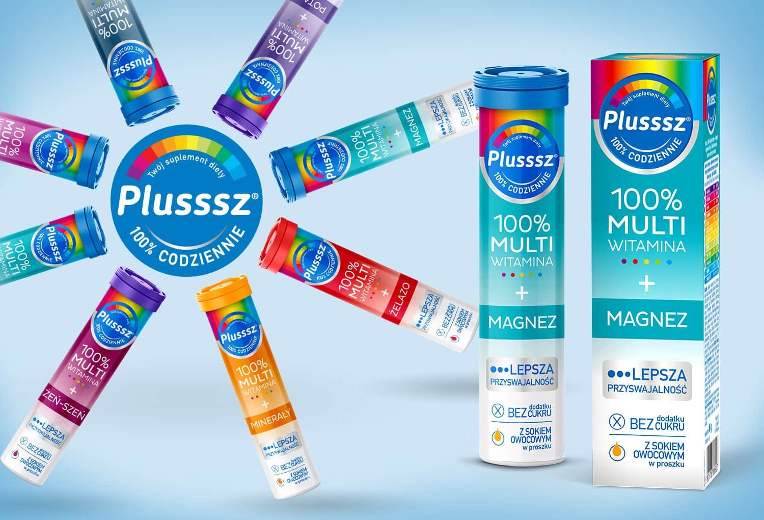
The packaging system had to handle effervescent tubes, cartons, a children’s range and a completely new shot format — and still look like one family.
02Solution
A fixed brand code and clear rules for variants.
We built the brand architecture around fixed elements that never change: the rainbow motif, the round Plusssz logo and a clear information hierarchy.
Variants are differentiated by colour, function name and benefit messaging — so shoppers find their vitamin in a split second, and the whole range forms a strong, consistent brand block on the shelf.
Brand architecture
Rules that allow the range to grow with new SKUs without losing consistency.
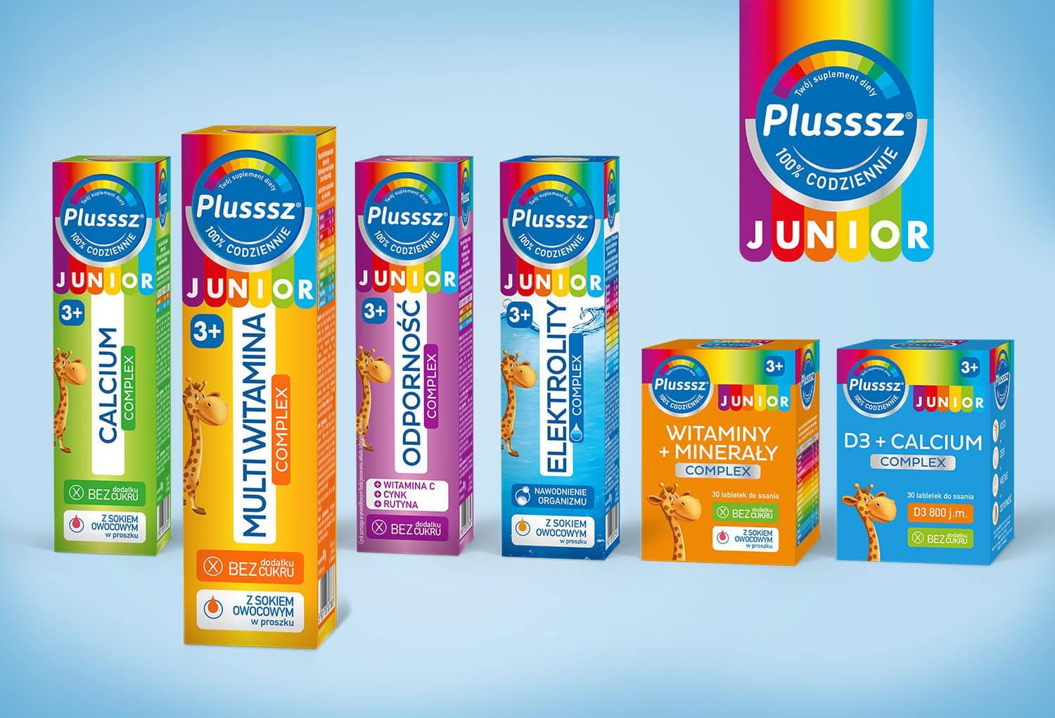
Children’s range
Plusssz Junior — a friendly visual language that stays true to the parent brand’s code.
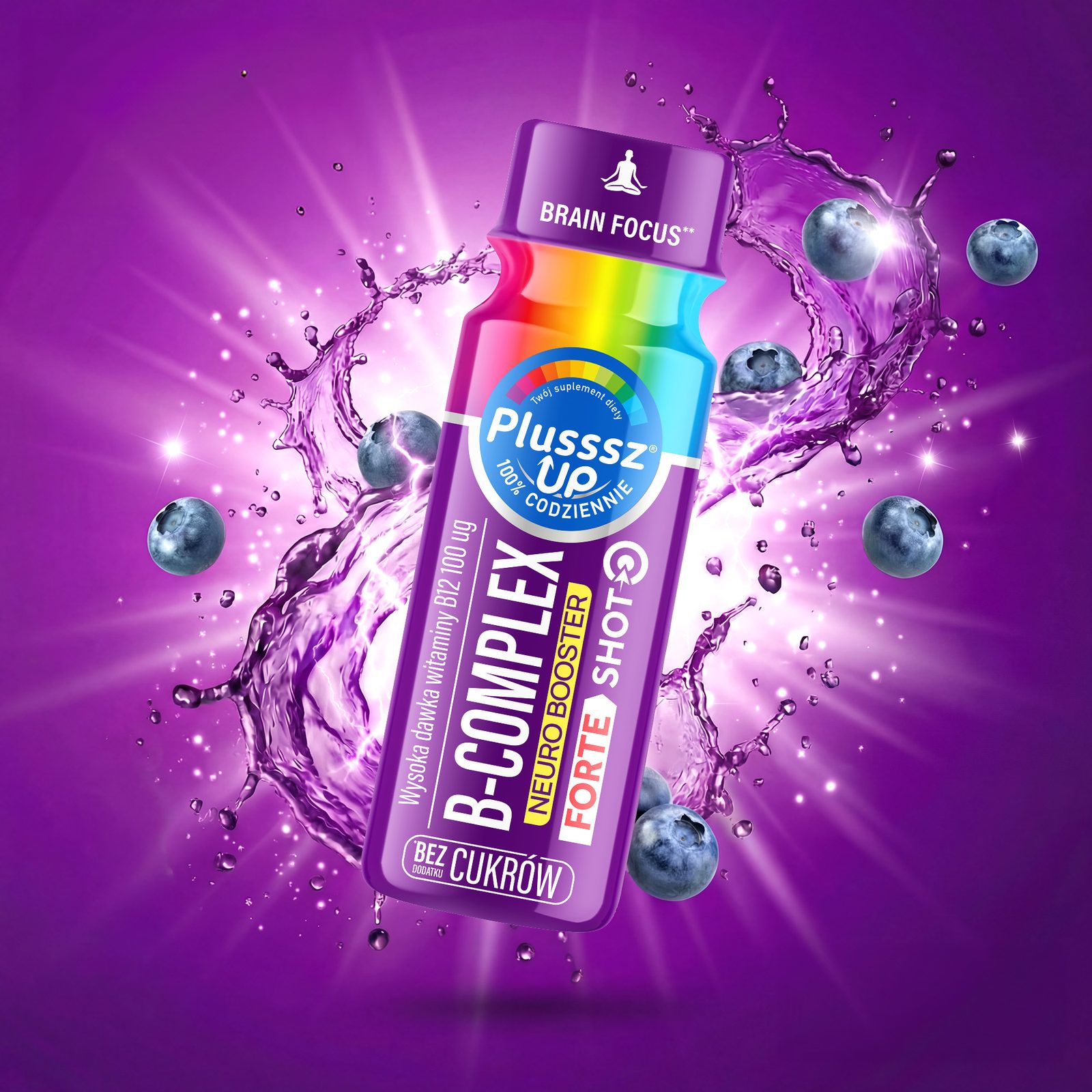
Key visuals
Dynamic product visualisations for campaigns, e-commerce and sales materials.
03Result
A brand that grows without losing its identity.
Every new Plusssz product immediately looks like part of the family — and the whole range builds one clear brand block on the shelf, recognisable from afar.
Scope of work
- Brand architecture
- Variant colour system
- Tube and carton packaging
- Plusssz Junior range
- Plusssz Up packaging and key visual
- Product visualisations
Contact
Your move.
Launching a new product, refreshing your packaging or planning a whole range? Get in touch — let’s talk about your brand.