
Case study · Food · private label
SPAR International. Three ranges, one shelf.
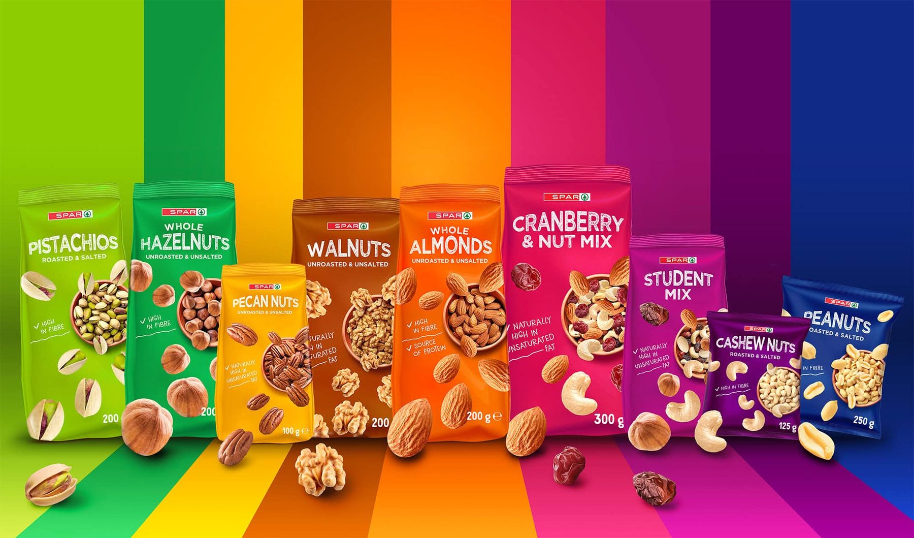
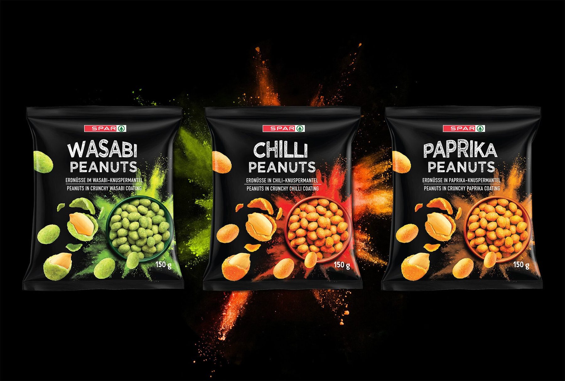
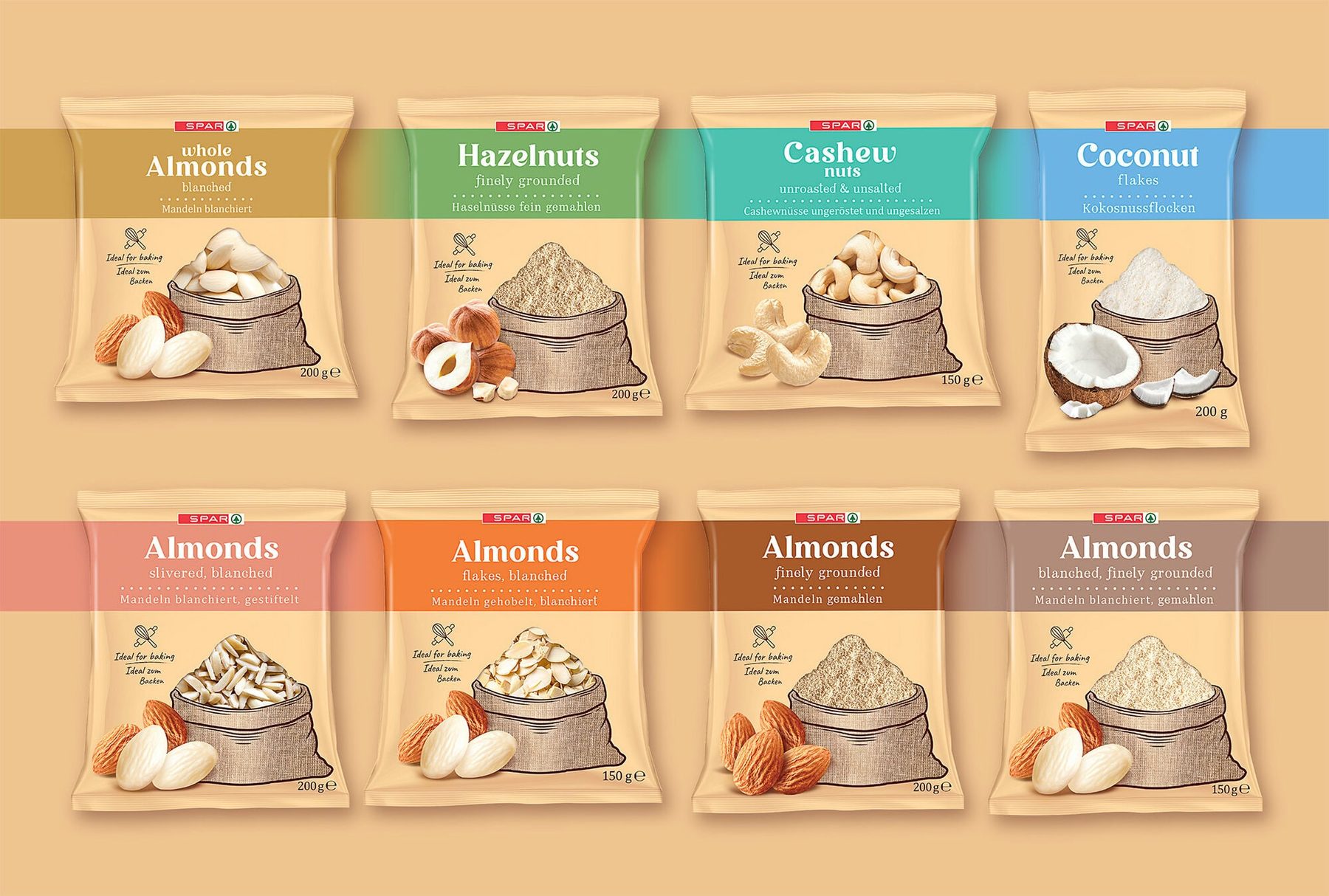
A nut and dried fruit packaging series for an international retailer: Snacking Nuts, Coated Nuts and Cooking Nuts — each range with its own character, all under the SPAR banner.
01Challenge
A private label that doesn’t look like a “cheaper alternative”.
Private label products compete directly with manufacturer brands on the shelf. The packaging has to build trust in the retailer and convey quality — without the backing of a dedicated campaign.
On top of that, there were three completely different shopping occasions: an impulse snack, nuts in a crunchy coating and baking ingredients. Each needed its own language, yet all had to be instantly recognisable as SPAR.
02Solution
Each range has its own mood — all share one structure.
Snacking Nuts use an intense colour palette — each type of nut has its own colour, so the whole range creates a striking rainbow on the shelf and makes choosing quick.
For Coated Nuts we went for black and explosive spice photography — wasabi, chilli and paprika stand out from afar. Cooking Nuts have a calm, natural look with a sack illustration and coloured variant bands — the packaging says “for the kitchen”, not “for the sofa”.
Three ranges, one system
A shared packaging structure and SPAR brand placement across all ranges.
Colour as navigation
Each variant has its own colour — shoppers find their product without reading the label.
Ready for many markets
Designed with language versions and international distribution in mind.
03Result
A private label with the character of a premium brand.
Three ranges that instantly say what they are for — while looking like one carefully designed family of SPAR products.
Scope of work
- Concept for three ranges
- Variant colour system
- Packaging designs for all variants
- Illustrations and photo compositions
- Language versions
- Range visualisations
Contact
Your move.
Launching a new product, refreshing your packaging or planning a whole range? Get in touch — let’s talk about your brand.